June's MATS Bootcamp assignment was Nautical wall art. Unfortunately I did not meet the deadline but I am still working on it.
I really enjoyed this theme. I did a lot of sketches of ships in bottles, sailors and mermaids, pirates, boats and sea creatures. I think the hardest part was deciding which elements to use but no worries, I will eventually flesh out the ones I like and save them for a rainy day.
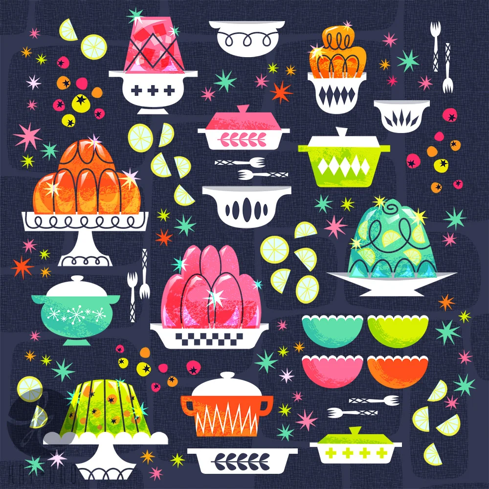
This was my original design for the MATS Bootcamp assignment for March. I had started this design but when we were given a challenge to use a neutral palette I went with this design for the final. It took me a while to finish up my original design. I spent a lot more time than I probably should, and I'm not sure if it's reflected in the final results. I have to admit that I did try out different techniques and effects that I hadn't used before in Illustrator for this piece so I don't feel the extra time and effort spent was a waste. I do like the texturing effects I was able to achieve (all in Illustrator).
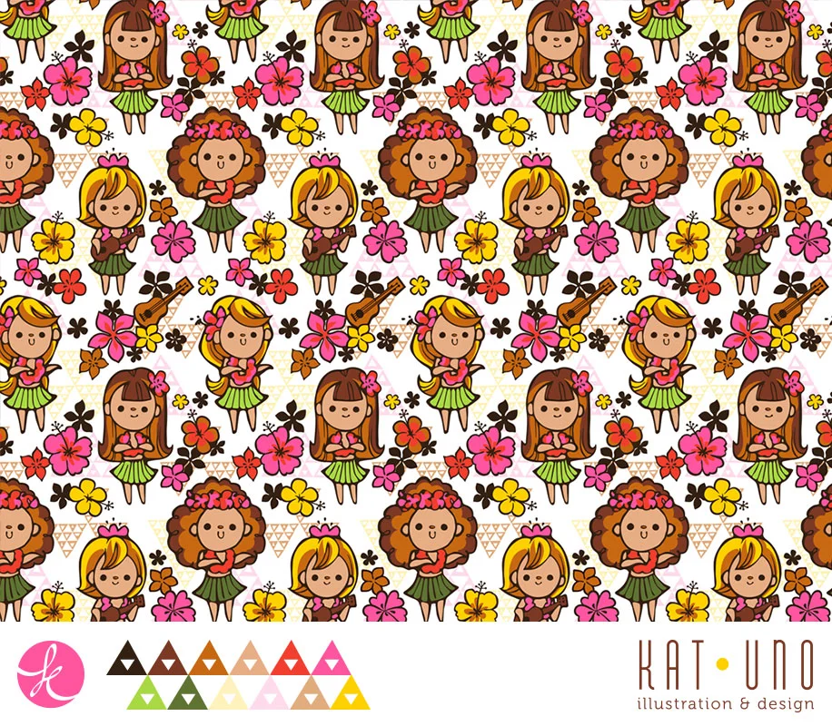
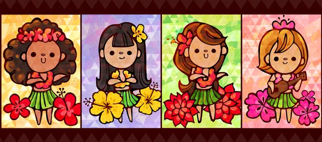
It was a lot of fun creating a pattern out of these girls. I tried to use a limited palette. There is so much going on that I felt the white background worked the best but I did try two other variations.
This is pattern is originally from a sketch I did on a post it. I liked how the little guys came out so I decided to make them into a pattern. Here are a few different versions with the same palette.
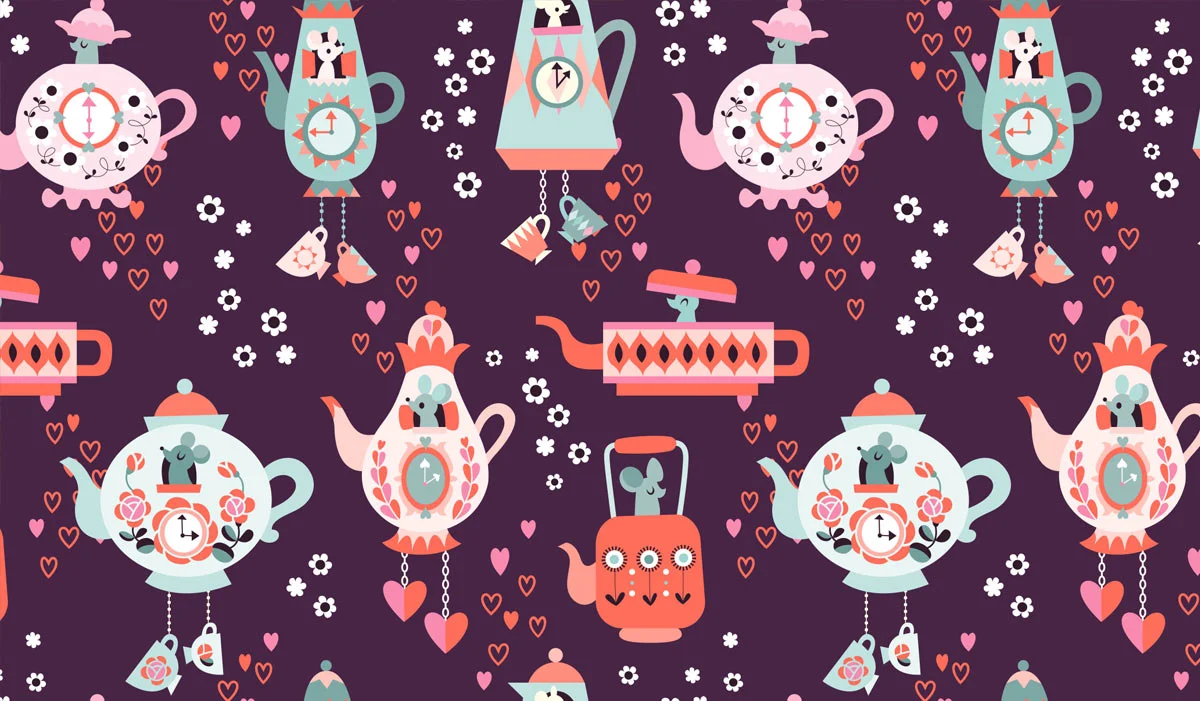
I decided to try and transfer my original Tea Time print to a pattern form. I have a hard time finding color combinations that I like and then getting them to work in my patterns. I'm happier with some color palettes more than others.
My knowledge about patterns is very sad considering my mom is an accomplished seamstress. I may update this post if I ever find out if there is specific terminology for these types of patterns. Here are closeups and larger views of the repeating patterns.
I really loved the first theme of cuckoo clocks for the MATS Bootcamp assignment for February. In a few of my doodles I explored teapot clocks inspired by the dormouse from Alice in Wonderland. I decided to flesh out some of my sketches after joining a Facebook group spinoff that posed "assignments" every month or so. It's more of a way to stay self motivated without actually committing to another class. I've found it very inspiring networking with so many other talented people who are in a similar boat as I am (wanting to do more creative work but are either too busy with family life or have a full time job that is not illustration). I've probably done more personal work and sketching in the past couple months than I did all last year!
Below you'll find my final piece with close ups of the individual patterns. I also started in a different direction which I'll post sometime in the future. I have also been working on expanding on the cuckoo clock theme from February which I really enjoyed. Hopefully more to come on that soon!
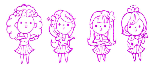
For this piece I started with a sketch (in ink) I liked. I took a photo of it (since I didn't have access to a scanner) and started inking it in Photoshop. I then proceeded to block in the skin and other large flat areas of color. I finished up with some simple blending and shading. It's not nearly as complete as I'd like but it was a fun exercise to get my feet back into digital painting.
really liked how these looked like as a sketch so I did a trace in Illustrator then added color and texture (in Photoshop). I wanted to try something different so I used triangles to give it texture. I like the effect but maybe I should have been more subtle. I may revisit these later. I feel like I want to give it a similar treatment as my other mini geisha illustrations.

